Tuesday, February 25, 2014

Tiling, Vol. 2 and Cabinet Hardware


Last weekend, I conquered the tile cut around the outlets.

This past weekend, I had the supports for the floating shelves to deal with.


I wish I could say I planned it--(I'm just having good DIY
karma right now--but the support rods almost all fell perfectly
on the edges of tile so I could just cut around them.

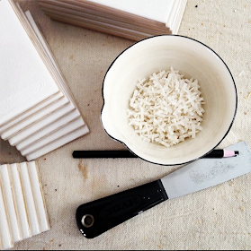
You'll notice the little stripes on the ends
of the tile.  That's some kind of plastic or hot glue that gets
added to prevent the tile from scratching in shipping.
They pop off really easily with the putty knife.


These half circles were fairly easily to clean out with the wet saw.


Not perfect but the shelves will cover my errors.


There was only one place where the rod fell right in the
middle of a tile.  They do make diamond-edge hole cutters
that fit on your drill but for $27 I thought I'd try this.

I cut the tile horizontally and then cut the hole in the center
of the cut.  It's not pretty the shelf covers it so who will know?
And I saved $27!


Another thing I found really helpful was drawing two
vertical lines that marked the placement of my first
whole tile in each row.  Such a time saver.


I'm really loving the reflection of light off the tile.
It really makes the kitchen feel brighter and larger.


As I got close to the ceiling, I decided to put in another
row of the cigar/pencil tile almost like a picture rail.
It was a spur of the moment decision but I think it
makes everything look very well planned.

For those of you that said I should leave the shelves
unpainted, I also see that possibility...but not this wood.
If I wanted to go that route, I'd look for some boards that
were a little more rustic.  Maybe I can have two sets
of shelves:  Spring/summer and fall/winter shelves.


I can't remember if I showed you the hardware I picked
out for the cabinets.  It's all from Restoration Hardware.
The pulls on the left are the Bistro Pulls, the round knob
is the Season Knob and the bin pull is called the
Ornate Square Pull, all in oil rubbed bronze.


The Bistro Pulls are used on the top drawers above
cabinets, and the knobs are on the cabinet doors.


The bin pulls were added to the old bin drawers.

I haven't yet painted the old bin drawers.  Once the new
hardware was added, it transformed them.  I'm kind
of liking them unpainted.  It's a little quirkier which is very me.

I do wish the two sets of bin drawers were a little farther apart
so the unpainted wood was better distributed around the room.
But I have to live with them like this for now.

Tuesday, February 18, 2014

Tiling


When I'm not shoveling snow, I like to kick back and install some tile.

I had a three-day weekend so I thought it was the perfect opportunity
to devote the whole weekend to getting the backsplash tiled. 


I can't stress enough the importance of planning.  You never want
to end up at the end of a row with a tiny sliver of tile.  If you don't
trust your math, why not just lay them out along your counter?
(Of course, you should use your spacers.)

I thought I would add a short backsplash on the sink wall
 of the kitchen so I did this little mockup with two rows of subway.


The tile will meet up in one corner of the kitchen so I'm adding the
same bullnose to the stove wall so that detail carries through on both sides.


All fairly easy until I got to my first outlet.  

I held a tile in place and marked out the sides of the outlet
with a black china marker.  Of course, I turned off the power
to the outlets before unscrewing them from the box.  One
thing I don't mess with is electricity!


Then I marked the bottom edge of the outlet.


And then drew the outline of the cut I wanted to make.


I bought a wet saw when I was replacing a bathroom floor
in my first condo ten years ago.  I recall it was about $100
at Home Depot and it was money very well spent.

It has an adjustable guide that will ensure straight cuts.


I cut down one side and then the other.

But now what?


I decided to make a diagonal cut just to remove a 
good amount of the tile I wanted to remove.


Then I made another diagonal cut to remove more.

I didn't quite hit the bottom corner but when I went to
make a second cut, it broke cleanly at the bottom edge.


With the remaining triangle, I made a series of cuts stopping
each time at the bottom edge of the opening.  These break
off very easily when you press on them.


All seemed perfect until I dropped it on the counter when
I was setting it in to place.  I kind of panicked at this point because
you'll also notice that the tile got stained from the terracotta-dirtied
water from the wet saw.  See it in the cracks?  I thought I might
have to come up with some other method of cutting the
tile...until I thought of painter's tape.

I mean, this stuff's supposed to lock out paint so maybe its
edge-lock technology would be enough to keep the
terracotta juice from staining my tile.


I left the "cut line" exposed and covered the areas
on both sides that might have gotten wet.

This worked like a charm!


This is my second attempt at the outlet opening with a piece
of tape down each side of the cut and one across the bottom.


This is what the back looks like.


After the first one, they're really pretty easy.

Also note that I cut the tile close enough to the top
and bottom to catch the flange of the outlet but not
close enough to cover up the screw holes.  So no spacers
are needed to bring the outlet flush with the tile.  But
I did need to get longer screws on some of the outlets.


I stupidly thought I could get this done in one weekend.
But everything takes at least three times as long as you expect.
And I'm not in any rush.  So what if it takes three weekends?
Slow and steady wins the race.


I really love that cigar detail a few rows up from the counter.
It makes it look a little more special.

Someone pointed out on my grout post that the ungrouted tile
shows you what dark gray grout would look like.

I kind of like it.


Friday, February 7, 2014

Tile, Grout, Lights and Floating Shelves


The tile I chose is made by Horus Art, the style is Tiffany in Biancho Crackle.
It's a nice soft white...with a little dash of cream.  I thought it was perfect.

But let's talk about your grout feedback.  It was really fun.

via SA Decor

                          According to your feedback about gray grout:

                          Pro:  Wouldn't look dirty
                          Con:  Looks dirty

                          Pro:  Looks like your favorite oyster bar
                          Con:  Looks like a Soviet butcher shop

                          Pro:  Adds interest
                          Con:  Too distracting
                          
                          Does that clear it up?

There were some of you that have used light gray in your bathrooms
and others that wished they had.  Some of you liked both.  And one
anonymous comment said if I used gray, our romance was over.
That's pretty serious stuff!

Overwhelmingly, though, most of you said white.

Mill Valley Loft, Remodelista.com
I'm in camp that likes both but I think they each have their place.  I see dark
grout as being industrial, even restaurant, perfect for a modern, loft-like space.
One commenter also suggested it's a vintage look and I can almost see it in
a place like The Breakers kitchen in Newport, Rhode Island.

It's also a great way to add pattern in space with clean lines.

Michelle's Mill Valley Kitchen, Remodelista.com
 I wanted a nice, clean look that didn't detract from some of the other unique details
I've put in the kitchen.  I love a lot of different styles and I'm slowly learning
I don't have to cram them all into one room.  So I'm doing white.


The light fixtures are all installed.  This is the Circa Milton Road pendant
and in the background is the cutie patootie E.F. Chapman Marine flush mount
in bronze also from Circa.  I'm not sure yet whether I'll have a table or island
underneath it.  I'm hoping my dining room table will work so I can turn
the dining room into a keeping room/den/library.  We'll see.


I chose the Milton Road pendant (by Thomas O'Brien) because 
its flutes beautifully echo the flutes in the columns in the cabinets.


I ordered another light from Circa for over the sink but it was very
backordered so I bought a backup which is the Franklin light from
Schoolhouse Electric.  I'm not in love with it and, yes, it's crooked.  I'm
pretty sure it's the shade, which incidentally fits horribly into the bronze
ring, so Schoolhouse is sending me a new shade.  Stay tuned.


In the last post, and a few photos back, you'll remember the blue tape
I put up to mark where floating shelves would go.  I wanted to show you
how those were made.  Holes were bored into the studs just slightly smaller
than the diameter of the 3/4 inch rebar.  And then the rebar is banged in to
the holes.  It's extremely solid. 


The shelf planks also have holes bored, just slightly larger so
they slide on easier but are still fairly snug.


These will be painted either white or light gray, I'll have to experiment.
Should I do white or gray?  I'm just kidding.

I'm off to pick up my tile and white grout.

Wednesday, February 5, 2014

White vs. Gray Grout

Domino
Today's a very gray day with lots of white snow falling so let's 
talk gray and white....grout, that is.

I've seen a lot of great kitchens using subway tile with gray grout lately.
Alison Cayne's kitchen in the Domino Holiday issue is a recent favorite.


On my "stove wall," I'm planning some floating shelves--I put up some
blue painter's tape just to experiment with their placement--but before
that, I'm going to be installing white subway tile from the counters to the ceiling.

via Our House blog

I've already purchased my tile--a soft white with a crackled glaze--and
I've already made a decision on the grout.  But if you look at these examples
of both white and gray grout, you'll see why it was a tough decision.

Crown Point Cabinets via Houzz

via Simply Seleta
via Plaza Interior

Daniella Witte via Skona Hem


Marta Stewart

Anna Kern via Desire to Inspire
Badgley & Mischka Kitchen, Elle Decor

via Houzz
This might be a lighter value gray.


via Apartment Therapy

Are you in the white or gray court...or do you love both?